AMP-Preview-Results

How To Add Google Analytics To AMP Pages

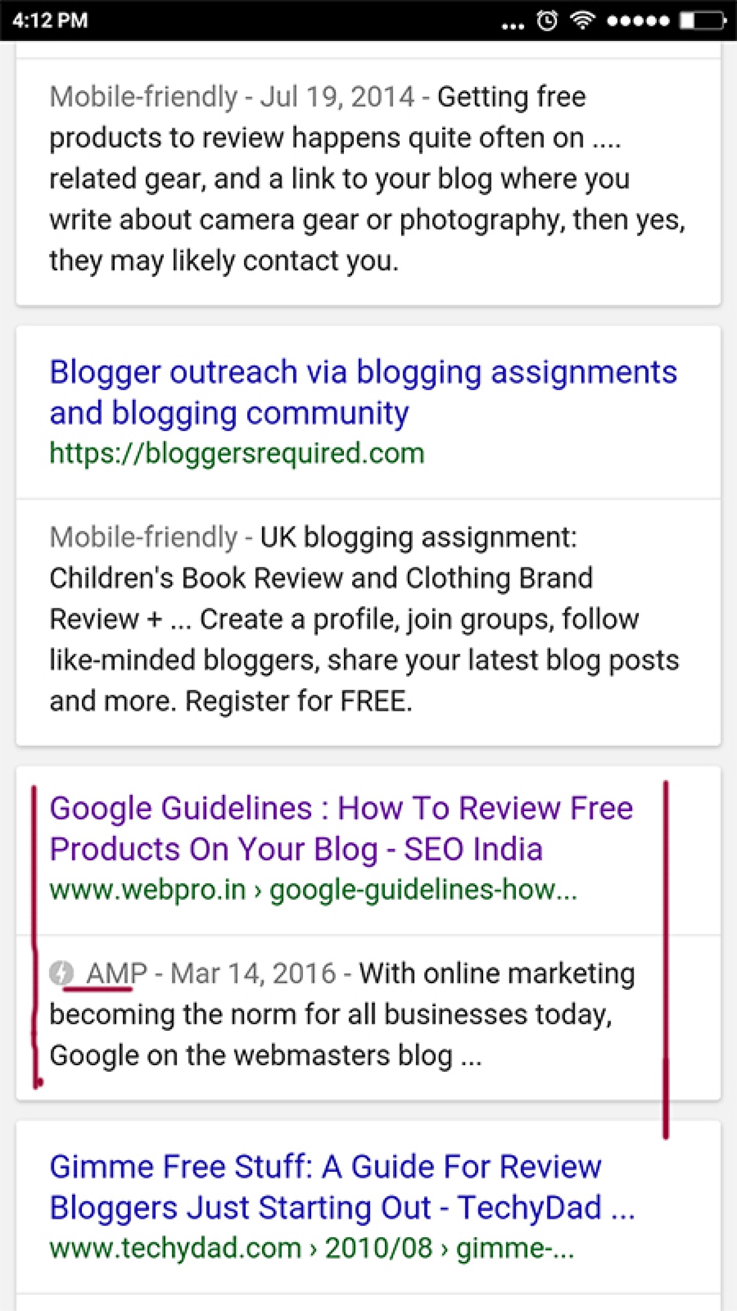
AMP Pages are the future for mobile search results. Google has announced recently that they will be removing “mobile-friendly” labels from search results and they also announced that they are testing to show AMP pages with a AMP icon  in the search results.

AMP-Preview-Results

Hence, soon the AMP pages will move out from the Top Stories section and will be a part of the SERPs. Considering how the mobile usage is exponentially increasing ,  making your site AMP compliant and tracking its performance is a necessity.

In order to add Google analytics to the AMP Pages,  include the following script in the <head>, before the AMP JS library:

<script async custom-element="amp-analytics"
    src="//cdn.ampproject.org/v0/amp-analytics-0.1.js"></script>

Add the amp-analytics element to the body of your page. Then to enable the built-in support for Google Analytics, set the type attribute of the amp-analytics element to 'googleanalytics'. It is recommended to include an id attribute so that you can easily identify each amp-analytics element (e.g. debugging).

<amp-analytics type="googleanalytics" id="analytics1">
  ...
</amp-analytics>
Note: It is recommended that you set up and use a separate property for AMP measurement.

Some other vendors offering Analytics For AMP Pages are:

  1. Adobe Analytics - marketing.adobe.com
  2. AFS Analytics  - afsanalytics.com
  3. AT Internet  - developers.atinternet-solutions.com
  4. Chartbeat - support.chartbeat.com
  5. Clicky Web Analytics - clicky.com
  6. Cxense -  wiki.cxense.com
  7. Google Analytics -  developers.google.com
  8. INFOnline / IVW -  www.infonline.de
  9. Krux -  help.krux.com
  10. Linkpulse -  docs.linkpulse.com
  11. Lotame -  mylotame.force.com
  12. mParticle - docs.mparticle.com
  13. Parsely -  parsely.com/docs
  14. Piano -  vx.piano.io
  15. Quantcast Measurement -  quantcast.com

Validation

To check if the analytics code is correctly added one can validate the AMP pages  on https://validator.ampproject.org/


Related Posts On AMP:

What Is AMP? All About Accelerated Mobile Pages By Google

AMP Pages To Be Shown In Main Google Search Results – Preview The Experience
Google To Remove Mobile-Friendly Labels and Keep Check On Interstitials For A Better Mobile Search Experience

What Google Has To Say About Mobile Rankings And Mobile Friendliness

Google published a blog post on  21st  April 2015 and confirmed that with mobile phones increasingly becoming the primary way for people to search the Internet, we want to ensure that when you search on Google you find content that is not just relevant and timely, but also easy to read and interact with on smaller mobile screens.

According to Google visitors abandon websites that aren’t mobile friendly at higher rates. And research shows 74% of users say they are more likely to return to a mobile-friendly site.

In February 2015, Google published a blog post mentioning that they want more mobile friendly websites in the search results.

Two important major announcements made by Google in February 2015 blog post were:

  • Starting April 21, we will be expanding our use of mobile-friendliness as a ranking signal, meaning more mobile-friendlysites in search results.
  • We will begin to use information from indexed apps as a factor in ranking for signed-in users who have the app installed.

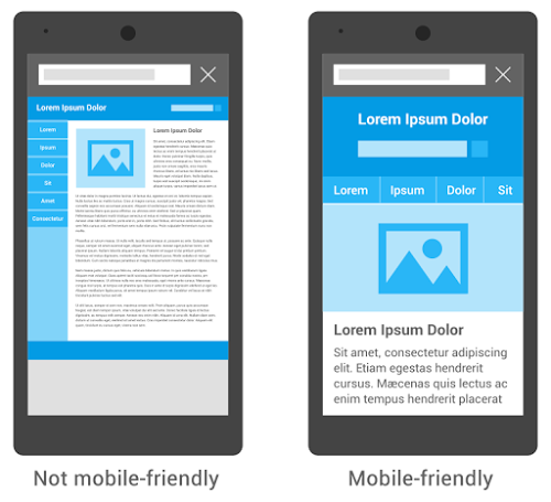
Google’s mobile ranking will now use mobile-friendliness as a signal that weighs in favor of pages that are formatted for mobile phones, like the image on the right.

 Google’s Mobilegeddon , Mobile Rankings And Mobile Friendliness

Points To Take A Note Of :

  • Back in November, Google introduced a “mobile-friendly badge” to notify users when a link in search results led to a mobile friendly-page, andprovided resources to help webmasters become mobile-friendly.
  • Google has started rolling out the change to take into account whether a site is mobile-friendly when Google ranks search results on mobile phones.
  • This change will be one of the 200 ranking factors and  non-mobile-friendly sites won’t disappear from mobile Search results—they may still rank high if they hold great content the user wants.
  • If you use Google search on your mobile phone, you can now more easily find high-quality and relevant results where text is readable without tapping or zooming, tap targets are spaced appropriately, and the page avoids unplayable content or horizontal scrolling.
  • In just the two months since Google announced this change, Google says they have seen a 4.7 percentage point uptick in the proportion of sites that are mobile friendly, and we hope to see even more in the coming months.
  • Webmasters can check if their site is mobile-friendly by examining individual pages with the Mobile-Friendly Test or check the status of the entire site through the Mobile Usability report in Webmaster Tools. Once a site becomes mobile-friendly, Google will automatically re-process those pages (and webmasters can expedite the process by using Fetch as Google with Submit to Index).

Google Algorithm Will Give Priority To Mobile-Friendly Sites Starting 21st April 2015

Google has always put the user at the helm when it comes to search. When it comes to search results Google focuses on the user and when it comes to updating the search algorithm it’s the user behaviour which becomes the focal point.

In February 2015, Google published a blog post mentioning that they want more mobile friendly websites in the search results.

Two important major announcements made by Google in the blog post were:

  1.  Starting April 21, we will be expanding our use of mobile-friendliness as a ranking signal, meaning more mobile-friendly sites in search results.
  2.  We will begin to use information from indexed apps as a factor in ranking for signed-in users who have the app installed.

Google Algorithm to find mobile friendly sites for search results

Google has clearly stated that starting  21st April 2015, they will be expanding the use of mobile-friendliness as a ranking signal. This change will affect mobile searches in all languages worldwide and will have a significant impact in search results. Consequently, users will find it easier to get relevant, high quality search results that are optimized for their devices.

Google resources available online to check and test the mobile-friendliness of a website are as follows:

Other Resources answering the following questions:

  1. Why make a website mobile-friendly?
  2. How do I start?
  3. What are the top three things I should know when building a site for mobile devices?
  4. How much does it cost to build a site for mobile devices?
  5. What should I think about when working with a developer?
  6. What are the top three mistakes beginners want to avoid?
  7. What are the next steps?

Related Posts:

Integrating The Print Media, Mobile And The Online Media With QR Codes

The user is always at the nucleus of any online marketing campaign. The user wants the most relevant information at the most easily accessible option which involves the least navigation and search activity in the whole process of finding the relevant information.

The challenge today is to reach out to more and more people via all the available options possible. We talk about integrated marketing and also integrating search and social but integrating print and online media via mobiles is something which has an easy accessibility and one can reach out to the targeted segment more effectively.

QR (Quick Response) as the name goes it can generate a quick response and is very cost effective. The use of the QR code can enhance the print media by empowering it with the digital dimension. QR Codes can be added to the newspaper Advertisements, coupons, visiting cards, leaflets which one distributes, etc. so that people can add the contact info or view your site readily from their smart phones without any delay and at their convenience.

For example below is the newspaper advertisement of a garment store and under the QR Code they make it very clear by mentioning how to use it and the reader can directly go to the latest collection on their website.

Key Points To Keep In Mind While Using The QR Codes:

· See that the reader reaches the most relevant landing page as per the content on the print media

· The landing page should have the call to action like a form, a buy button, contact details, subscribe button or whatever is the purpose of the page

· One can easily track the ROI from such a campaign as the page can be easily tracked and monitored via analytics and one can even create a special landing page for such a campaign to calculate the ROI and study the response to the Ad.

This is gaining popularity and soon becoming the norm for integrating the print media with the digital media for easy accessibility and a wider outreach.

The Mobile Web And The Mobile Apps.

We all know that the future is mobile and this is proved by the escalation in the sales of the smart phones and the boom in the mobile apps. Market. At the same time the internet connectivity, wi-fi accessability and the internet speeds are also improving on an increasing scale so the mobile web is also showing a trend of easy access and usability.

With this scenario the question arises - Should one go for a mobile website or a mobile app.?

There are some critical differences between the two which need to be considered before taking a final decision:

Mobile Apps:

  • They are like the software packages designed with a specific purpose and which need to be downloaded and installed for a particular brand smartphone.
  • They need to be made portable for the requisite platform like – Blackberry, iPhone, Android, etc.
  • The apps. In order to be successful and have increased usability it needs to be developed very well keeping the user and the small screen of the handset in mind.
  • You need to come up with improved versions of apps. Regularly keeping in mind the advancements of the handsets being regularly launched in the market.
  • As the browsing technologies improve it is imperative to improve upon the apps. too.

Mobile Website:

  • A website especially designed for mobile devices.
  • This mainly has links to other pages which provide text information about your products and services and the contact details.
  • Unlike the Apps. It does not need any installation and it can be accessed by anyone having an internet connection but the only difference is that it is designed to suit the browsers and screen sizes of mobile devices.
  • Your mobile website can be found on search engines by users once you optimize it.

But, with the mobile web getting better and better it makes sense to have an optimized website which can have a larger access easily but again there are situations when apps.  may be more viable like for example where downloads and easy payments are the main feature for the users for example  like if you have an iTunes like product which you want users to buy and download on mobile devices.

Identify your need weigh the pros and cons and then decide. But, again to sum it up all sooner or later with the advancements and improvements in technology on both the hardware and software side there will be an integration resuting to websites suiting all devices desktops, laptops, tablets and smartphones .

Enhanced by Zemanta

What Is IP Delivery And How You Can Use It?

IP based delivery is serving content to users based on their IP address. Serving different content to users from different countries or locations is not cloaking and is very much a white hat technique. Cloaking is showing different content to users and different content to  the search engine bots which is not as per the Google guidelines.

The reason for varied content targeted based on IP address could be to display region specific Ads, varying costs for shipping as per the location, change the language as per the location or even different  discount rates as per location.

The following 2 videos explain how Google handles this aspect of IP delivery.

The Advantages of M-Commerce

Author : Wasim Ismail

The wider connection a business can make to their target markets, the higher possible sales they can have. With this, maximizing benefits from the current technology like mobile devices is a big step that industries need to establish.In connection, the development of Mobile Commerce or M-Commerce gives an opportunity to many businesses to offer flexibility for their customers to have access to their business from devices such as mobile phones.

M-Commerce is the term for making business transactions using mobile devices. There are already several existing M-Commerce applications and services nowadays that have been very helpful to us. Some are mobile banking, location maps, and variety of news, mobile shopping, ticketing and mobile file sharing.

Mobiles are being used more and more on daily basis and its more then just making and receiving a call. Mobile companies are coming up with new features for their smart phones, which offers consumers ease, flexibility and security at the same time. My self I have a Blackberry and an iphone which I use both to run my online business, from sending and receiving emails, online accounts, socialise on Facebook and Twitter and also paying for my shopping so I just need to collect it. I believe if I was to loose my phone, I would be lost, as I would have no communication, besides my wife calling me, I wouldn’t be able to operate my day to day business. Having these features on my phone, saves me hours in a day, as I don’t go home to a full inbox of emails, I don’t need to wait in queues to collect my shopping, as I have already paid for it.The integration of M-Commerce to a handy device is an immense benefit to all of us, as I have just demonstrated above.

Below are some of these advantages:

Convenience

It is a true convenience to do much from a handy device via M-Commerce. With wherever you are, in just a few clicks on your mobile device, you can already do shopping, banking and download media files.

Flexible Accessibility 

User can be accessible via mobile phones and at the same time be accessible online too through logging on to various mobile messengers like Yahoo and Gtalk and other networking platforms.On the other hand, user may also choose not to be accessible by shutting down his mobile device, which at times can be a good thing.

Easy Connectivity 

As long as the network signal is available, mobile devices can connect and do commerce transactions, mobile to mobile and even mobile to other devices. No need for modem or WI-FI connectivity set up.

Personalization 

Each mobile device is usually dedicated to a specific user, it is personal. You can do whatever you want to your mobile device, modify the wallpaper, change view settings or modify contact information as you send emails or e-payments.

Time Efficient 

Doing M-Commerce transactions do not require the user to plug anything like personal computer or wait for the laptop to load. Just hit the on button of your mobile device and your ready to go.

Despite the small screen, having something in your pocket that can do so much via M-Commerce is really an amazing technology and a great help. E-Commerce business are also making applications for mobile phones which allows users to browse their online products and make payments with couple of buttons.

Is Mobile Commence appealing to you, is this something you would implement into your business, share your thoughts with us regarding mobile e-commerce in the comments below.

Ecommerce & Mobile Web 2011 – Time To Take Your Store Online If you Want To Future Proof Your Business

The latest buzz on the gizmo gadget scene is that Smartphone usage is set to increase dramatically with the sales volume forecasted to rise from 174 million in 2009 to 500 million in 2014 with a CAGR of 16.28%.

News is also dominated by headlines like : 

  • Smartphone sales jumped by 34 per cent in third quarter of 2010: IDC India 
  • "Overall, Indian smartphone sales are expected to touch 5.96 million units by end of 2010," says Naveen Mishra, lead analyst, Mobile Handsets Research, IDC India. 
  • "The propensity to adopt feature phones and smartphones is greatest amongst the youth and business executive segments, whose purchase decisions are often driven by peer group influence and workplace usage patterns, as well as larger disposable incomes and willingness to experiment with new technology platforms," Anirban Banerjee, associate vice-president, research, IDC India mentions in an official communiqué. 

The phones are being used more like laptops . The desktops were discarded for laptops and now smartphones are being seen replacing the laptops in increasing numbers.

With more and more Apps. Being available for smartphones the ease with which you email, communicate, connect to social media sites, play games or even surf websites on these phones is making people use the phone more than their laptops.

According to John Shen, the Lab Director at Nokia Research Center, the smartphone of 2015 will go even further: You will be able to link phones together to form a cluster where a group of phones provides PC-like processing capability.

In short the web is becoming more and more mobile . This is backed by the statements made by the people in the online industry during this season on online sales:

  • Daily online sales exceeded $1 billion on six days this season, which was twice as many days as a year ago, said Michael McNamara, a vice president at SpendingPulse. The growth meant online sales grabbed a larger share of the season’s total sales, he said. 
  • “Today eCommerce accounts for a much larger share of overall retail sales compared to a few years ago. And during this holiday season, it registered double digit growth for 6 out of 7 weeks,” Michael McNamara, vice president of MasterCard Advisors SpendingPulse, said in a news release.

The main point to be noted is that the chidren of today get their first phone by the age of thirteen and are also used to the mode of cashless payments.

Hence it is very important to note that the teens and twentys of tomorrow will be more accustomed to online buying, if your store is online and has a wide presence on the web then your business has a future else there is a full possibility that you lose the online market share to your competitor who might have gone online and mobile before you.

The web removes the geographic boundaries and offers you the option to target the local and the global markets depending on your online strategies.

As the smart phones become smarter we also have to become smarter to adopt the revolutionary and evolutionary changes and learn how to balance our virtual and real lives at the same time benefitting from the benefits of the online world .

SEO Ahmedabad

Contact Info

802, Astron Tech Park, Satellite Road, Opp. Gulmohar Park Mall, Ahmedabad 380015, India

+91 9825025904
info@webpro.in

Daily: 9:00 am - 6:00 pm
Sunday: Closed

Copyright 2023 WebPro Technologies LLP ©  All Rights Reserved