What Is Responsive Web Design?
Responsive web design (RWD) is a web design approach aimed at crafting sites to provide an optimal viewing experience across a wide range of devices -from desktop computer monitors, tablets to mobile phones. Responsive web design is the latest web design trend of 2013 and becoming a standard practice for the web design industry .
A website developed using Responsive Web Design adapts the design of the page depending on the device it is going to be viewed. Hence, RWD uses fluid proportion based grids, flexible images and CSS3 media queries.
- The fluid grid concept calls for page element sizing to be in relative units like percentages, rather than absolute units like pixels or points.
- Flexible images are also sized in relative units, so as to prevent them from displaying outside their containing element.
- Media queries allow the page to use different CSS style rules based on characteristics of the device the site is being displayed on, most commonly the width of the browser.
Why Is Responsive Web Design Becoming The Hottest Web Design Trend Of 2013 ?
The Forrester Research Mobile Advertising Forecast, 2013 To 2018 (US) predicts that mobile ad spend (smartphones plus tablets) will represent more than 29% of the total online ad spend in the US by 2018.
According to eMarketer the devices used to access the internet by US consumers from July 2011 to Jan 2013 were as follows:
As you can see the desktops use was reduced 3 %, the use of tablets increased by 6%, and the use of mobile phones increased by 10.5% which means an over all increase by 16.5% for hand held devices.
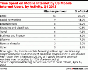
The time spent on Mobile Internet by US Mobile Users in the first quarter of 2013 by activity is as follows:
As we can see that email and social networking are at the top which directly is related to business hence as the smart phones become smarter and people become more dependent on them no company website can ignore responsive design in the coming future.
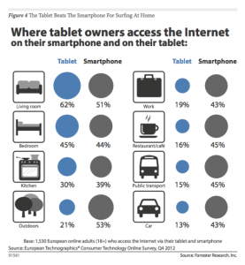
If the use of various devices by the user is increasing on a regular basis and the choice of the device depends on the place the user is surfing from, then surely the website has to get adapted to the device and display the right content according to the size of the display unit of the device.
According to Jeffrey Veen (The Vice President of products for Adobe):
According to - Jeremy Keith :
“Stop Thinking in Pages. Start Thinking in Systems”.
Jeremy Keith in the video on http://vimeo.com/50745034 explains some of the following points and much more:
- Responsive Web Design requires the rewiring of our brains to think about designing for the web just as we started thinking differently when we started using CSS and separated the content from the design.
- Responsive design is not about taking your existing device specific design and shrinking it for smaller devices. One needs to start from scratch.
- We need to think about content outwards rather than about canvas inwards as on the web we don’t know the canvas. Content over here is not necessarily copy , text or words but can be anything from a task or a user flow like the check out function on a shopping site or a post to a forum page, etc. are all fundamental units of content.
- Prior to Responsive web design visual designers sort of dictated the system requirements to the user like the browser used, internet speed specifications , javascript capabilities, etc. but responsive design is more like a dialogue between the designer and the user and ensures that the website meets the user wherever he is.
- If you want to be future friendly one of the best techniques is to be backwards compatible.
- He ends the presentation with a constructive thought that responsive design is not about mobile but about the web.
Responsive Web Design And SEO: Does Google Support RWD?
Yes, Google supports Responsive Web Design
1. Google supports sites which use same URLs for different device specific layouts i.e the HTML is the same for every device but only the CSS changes as per the display required for the specific device.
2. Or, if the URLs remain the same but the HTML and the CSS change as per the user agent.
3. Or, have separate sites for mobile and web.
4. Be sure not to block the crawling of any Googlebot (i.e for the web or mobile) for the page assets (CSS, javascript, and images) using robots.txt or otherwise. Being able to access these external files fully will help Google algorithms detect your site's responsive web design configuration and treat it appropriately.
5. Googlebot and Googlebot-Mobile should should automatically be able to detect this setup while crawling the page assets like HTML, CSS, Javascript.
6. The Vary HTTP header helps Googlebot discover your mobile-optimized content faster, as a valid Vary HTTP header is one of the signals Google uses to crawl URLs that serve mobile-optimized content.
7. If the responsive design servers use different URLs for desktops and mobiles then on the desktop page, add a special link rel="alternate" tag pointing to the corresponding mobile URL. This helps Googlebot discover the location of your site's mobile pages.On the mobile page, add a link rel="canonical" tag pointing to the corresponding desktop URL.
8. This rel="canonical" tag on the mobile URL pointing to the desktop page is required to avoid duplicate content issues which have an adverse effect on the SEO.
9. Google supports the rel="alternate" annotation for the desktop pages in Sitemaps as follows but the required rel="canonical" tag on the mobile URL should still be added to the mobile page's HTML.
<?xml version="1.0" encoding="UTF-8"?>
<urlset xmlns="http://www.sitemaps.org/schemas/sitemap/0.9" xmlns:xhtml="http://www.w3.org/1999/xhtml">
<url>
<loc>http://www.example.com/page-1/</loc>
<xhtml:link rel="alternate" media="only screen and (max-width: 640px)" href="http://m.example.com/page-1" />
</url>
</urlset>
Is HTML5 The Right Choice For Responsive Web Design?
Matt Groener, Intel Developer Zone development team manager says:
- "HTML5 is the backbone of the new and interactive features of responsive Web design,"
- "Developing in HTML5 benefits all of the ecosystems because you get to market faster,"
- "You don't create an iOS app and then, when time permits, bring it to Android or Windows. You can do it in any or all ecosystems at exactly the same time."
- “It will only get better for developers as HTML5 matures, becomes faster and adds more features that put it on par with native application development. The future is more responsive rather than less responsive. I don’t see that ever changing.”
Don’t you think it is high time to opt for Responsive Web Design and let your virtual presence flow to fit any device the user has?
What do you say?


